


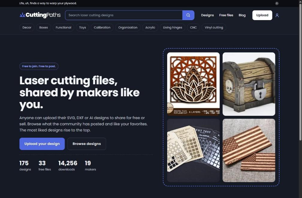
Cutting Paths just got a full redesign. Same designs, same accounts, same downloads, just a better place to find and share them. Here are the highlights.
- Dark mode by default. Prefer light? Tap the sun icon at the top of any page and the site remembers your choice.
- Faster pages, especially on phones. Images are now sized for your screen instead of loading full-size originals, and most pages score 90 or higher on Google’s mobile speed test.
- A homepage built around the community. Anyone can post their designs for free or for sale, and the most liked designs rise to the top.
- Instant filters. Narrow any list by category, material thickness, or price, and the results update without reloading the page.
- Cleaner design cards. Every card shows the maker, likes, save, and share in the same spot, so a page full of designs is easier to scan.
- Maker stores stand on their own. Each store now has its own page title and link, which makes it easier to find in search and to share.
- Upload from anywhere. The Upload button sits in the header on every page, and the upload form and image picker got a fresh look in both dark and light mode.
- Up-front fees. When a paid design sells, the maker keeps 85%. The full breakdown is at the bottom of the homepage and in the Seller FAQ.
- More accessible. Stronger contrast, clearer labels for screen readers, and better keyboard support.
Spot something that looks off or have an idea for what is next? Let us know.